Member-only story
Best Practices for Designing UI Cards
Cards UX Design Guidelines + Types of Cards
Published in
7 min readNov 11, 2024
Non-Medium members can read the story here.
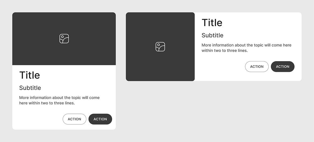
Cards are important UI components that organize and present information in a clear and user-friendly format.
Due to their flexible and modular layout, cards can be used across various applications, helping users quickly engage with content.
Designing a card requires consistently applying UX principles to ensure it serves its purpose effectively.
This article covers best practices and UX guidelines for designing cards. In the later section, we will explore different types of cards that can be used in various situations.
Why UI cards are important
- UI cards are versatile containers that visually group information and actions related to a specific subject.
- They help break down complex data into digestible sections, making it easier for users to navigate and understand content.
- Cards can dramatically improve engagement by allowing users to interact with the content effectively.
