Member-only story
Tabs Design Best Practices

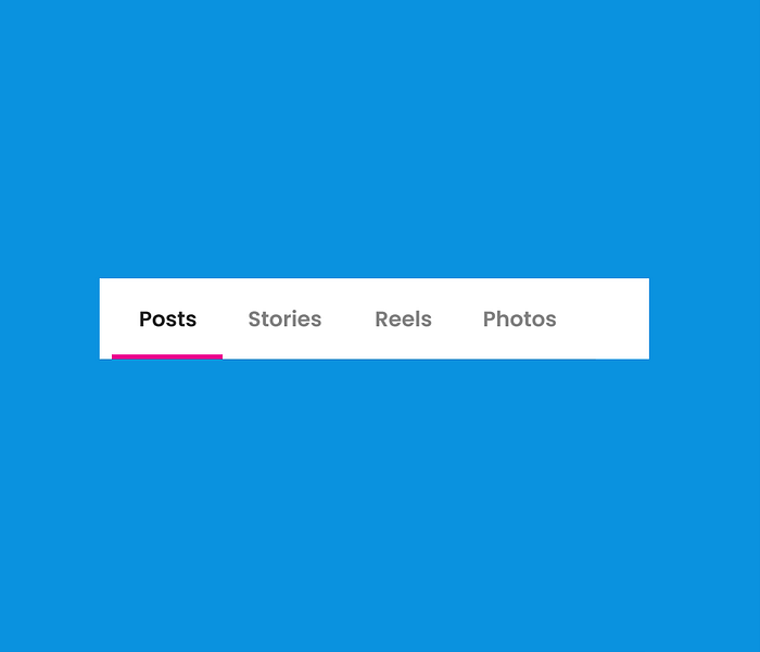
Tabs are UI controls used to organize the content of a page into multiple panes where users can see one pane at a time. The content is related and lies in the same hierarchy in the application. Tabs provide a way to navigate between different sections of a page to see the related information distributed among these sections. For example, the details of a user profile can be shown using Tabs: Personal, Professional, Education, etc.

Anatomy
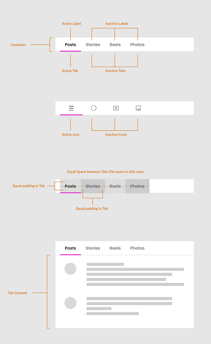
The tab bar has several elements and states that make it easier for users to interact with the control. It is crucial to design these elements and states carefully so that the tab bar is discoverable and usable in the design. A detail of these elements and states is given below.

- Container
- Active / inactive tab
- Active / inactive label
- Active / inactive icon
- Content
- Uniform space between tabs
- Uniform padding in tabs
